Scatter Diagram examples

Last Updated on July 4, 2025 by
What is the scatter Diagram and why it is used?
A Scatter diagram is a pictorial presentation of the relation between two variables.
A Scatter diagram can be used to find out the correlation between the variables.
For example, from the scatter diagram we can find out that the height and weight of a person have some relation with each other.
The scatter relation is defined as:
where, \( X\) represents the independent variable (height or weight), and \( Y\) represents the dependent variable (height or weight). The correlation coefficient between two variables is also sometimes called an r-value. It can be defined as the proportion of pairs in which both variables are in the same direction (positive numbers) or both are in opposite directions (negative numbers).
Although scatter diagrams are not drawn with every data set, there are a few data sets where scatter diagrams should be used.
Example:
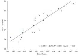
– Relationship among variables in the same direction.
for example, when height and weight increase together, or when debt and income increase together. [See below diagram]
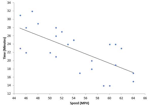
– Relationship between variables in opposite directions for example, when height increases and weight decreases.
[See below diagram]
Why does it work for these data?
Height is independent of weight so we get a positive correlation Coefficient (r = +0.177). Similarly, we get a negative correlation coefficient (r = -0. 069) for the variable income which is significantly different from zero.
Example: If there are interests in a certain stock and the price of that stock rises, the number of people who buy that stock will also increase. This means that we can use this influence to predict the future price of the stock. The correlation between the two variables is +0.596, so it indicates a positive or high correlation between the variables in question.
To find out the price of a stock at present, you need to know how much it has risen in the past. To measure this rise, we use a data point called the current value. But to predict the future rise (we will use this set of data to test our model), we need to solve for past values for this variable.
Example: The XYZ Company sells many different products. It sells more products by price increases than by quality increases (the sales increased by more than $5 million after each increase in quality). Also, sales decrease when the price of the product is decreased by more than $5 million.
This situation is used to illustrate a trend. When you predict the stock price in the future, you should take into account these trends, such as how many stocks will be sold by an increase or decrease in price. These trends are not easy to analyze and they change over time (for example, when stock prices fall for long periods of time, some investors may lose interest in stocks).
What tool to use to make a scatter diagram?
Nothing special needed for the creation of the scatter diagram, all you need is a list of pairs of values for each variable.
To find out the relation between two variables, you must create a scatter diagram, where both variables are represented by their natural values. The two-variable relation can be expressed as follows:
Where \( X\) and \( Y\) are the variables (or values ??of those variables) and \(a\) and \(b\) are constants or coefficients. The coefficient can be 0 if both variables are independent of each other.
To get the scatter relation between the two variables, you need to collect all the pairs of values of \(X\) and \(Y\) which form a complete scatter diagram (where you place two points on each variable). Then, for every pair of values, calculate the correlation coefficient:
Where \(r\) is defined as a ratio of \(a/b\). The value \(r = 0.0 \ll r\ll 1.0\), or when neither variable is connected to another and their relationship is “neutral” (which does not mean that they are completely unrelated).
Conclusion:
The scatter diagram method is a useful tool for the analysis of relations between two variables. It is used to visualize the correlation between two variables and to learn how they are related. To create a scatter diagram, you need to get pairs of values of the two variables and calculate the correlation coefficient between them. The value of \(r\) gives the degree of correlation between two variables and tells us what kind of relationship exists.
* SCATTER DIAGRAM CONSIDERATIONS
- The correlation coefficient of zero does not mean that there is no connection between the two variables, but only that the strength of the relationship between them is very weak. in general, the direction in which there is a higher correlation between two variables is greater than 0.5 (there are some cases where there will be zero correlation with a directional trend).
- The more correlated these two variables are, the more confidence we can gain from using them to predict future values ?? of both variables. In conclusion, you need to see if both trends rise and fall together in significant amounts.
- The term “significant“ in the context of statistical analysis means that the correlation is greater than 0.5 and less than 1.0.
- In situations where the correlation between two variables is high, the correlation coefficient (r) may be close to 1, but it does not mean that this situation will exist indefinitely in the future.
- When you predict the variables X and Y (= price), both positive and negative changes (in other words, we assume that there will be changes in \(X\) and \(Y\)), but these values ?? will vary over time.
- In the case of multiple correlation calculations, you can look at the scatter diagram (the graphic plot of data) to see through all the variables.
- If the scatter diagram shows no relationship between the variables, consider whether the data might be stratified.
- When the correlation is high (closer to 1), you can say that both variables are strongly related and that their relationship is almost linear on the scatter diagram.
- Not all data sets lend themselves to visualizing diagrams of two variables.
Trends that are not related or data that does not show strong trends (such as with normal distribution) do not lend themselves to visualization by a scatter diagram.
Looking for More Resources on ISO 9001?
If you found this article helpful, explore our premium resources designed to help you achieve ISO 9001 certification efficiently:
- Complete Documentation Package for ISO/IEC 9001 2015: Get all the essential templates and documents you need for fast, easy implementation.
- Online Course on ISO/IEC 9001 2015 : Enroll in our comprehensive training to master the key concepts and practical steps toward certification.
- ISO/IEC 9001 2015 Checklist: Download our detailed checklist to ensure you’ve covered every step of the process.
These resources are tailored to meet your needs and ensure a smooth certification journey. Explore them today and get one step closer to success!
Related Posts


ISO/IEC 17065 Training Course : Product, Process, and Service Certification

ISO 22716 2017 Online Training : Good Manufacturing Practices for Cosmetics

ISO/IEC 17021-1 Online Training – Management System Certification